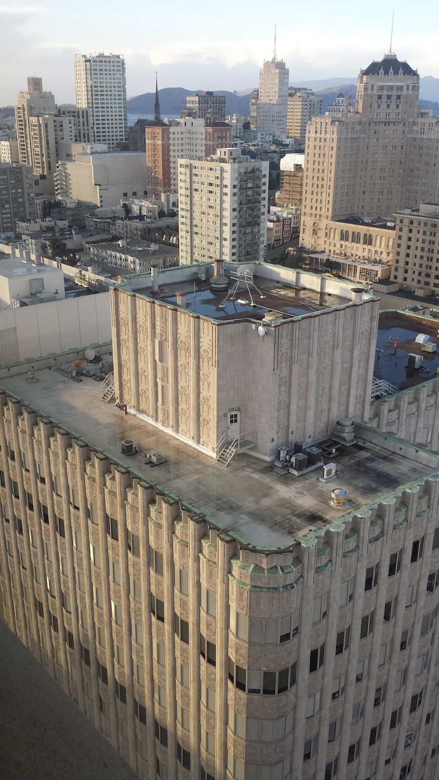
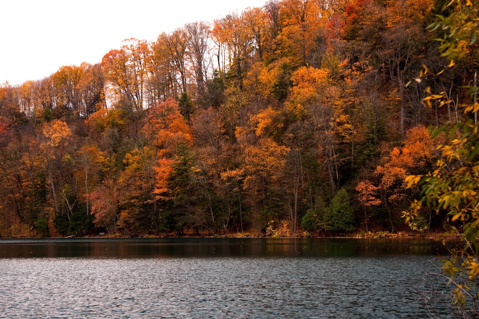
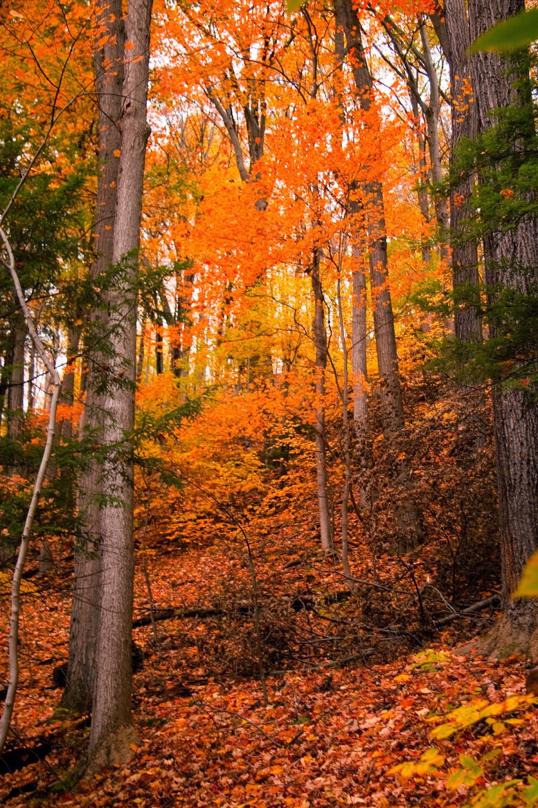
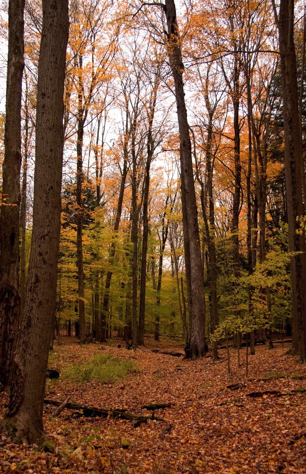
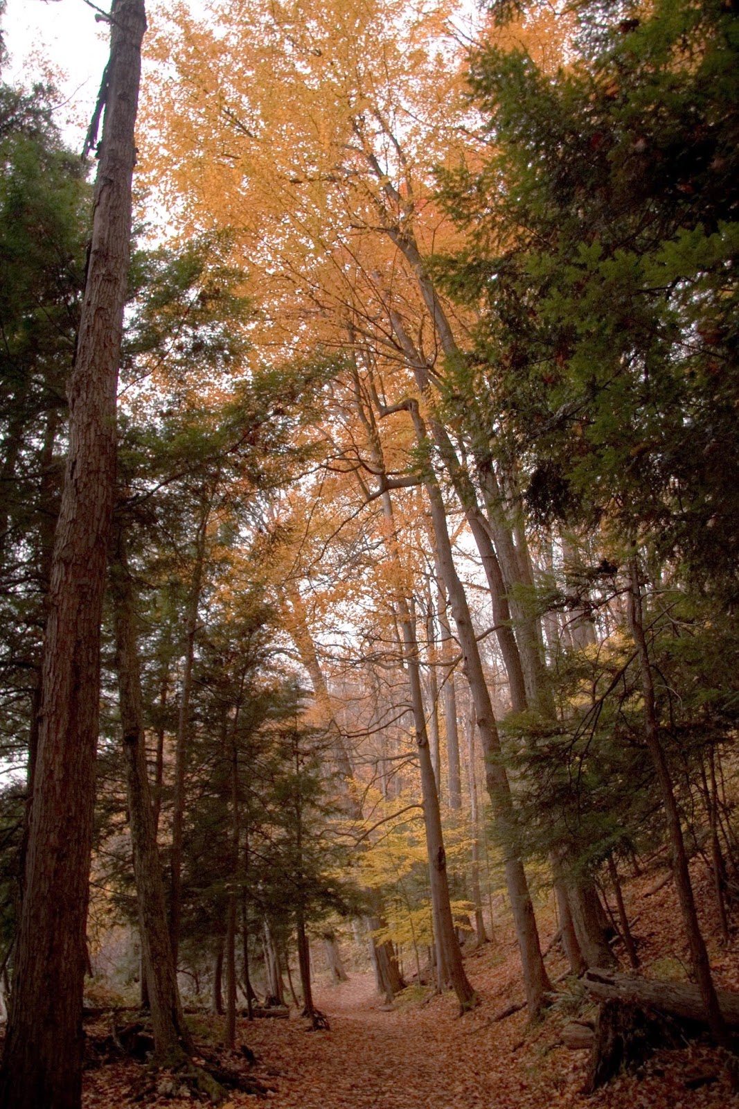
I arrived in San Francisco yesterday (Saturday), and had a lovely afternoon exploring my new temporary neighborhood. This morning I had an early start, navigating Muni to get downtown for a Geoprisms RIE (Rift Initiation and Evolution) mini-workshop. The meeting was on the 36th floor of the Hyatt. After the heavy rain in the morning, the sun came out, and during the breaks people naturally drifted to the windows to enjoy the view.
The workshop was great. There was a lot of talk about magma and melt generation, but also the need to study the surficially-amagamatic parts of continental rifts (hey, that's where I work...). The morning rift workshop was followed up by an afternoon/evening STEPPE workshop about how awesome Lake Tanganyika is (Lake Tanganyika: A Miocene-Recent Source-to-Sink Laboratory in the African Tropics).
This day was great for me - lots of things for me to think about for my current research and the manuscript I'm working on, but also lots of ideas for future research.
Monday, December 14, 2015
Wednesday, September 2, 2015
Kids don't belong in universities.
Don't let the title fool you This post isn't about students, it's about how we treat them.
The fall semester is underway for most of us. The students I TA saw me yesterday in their lecture, but I won't meet them until the week after next. The start of a new semester seems like a good time to start a discussion about how we, as TAs, professors, and non-academic staff, treat students. It drives me crazy when I hear college students, most of whom are legal adults, referred to as kids.
If you do a Google search for "kids," what comes up are programs, clothes, and toys marketed towards grade-school people. Our students have outgrown this marketing demographic, so why do we still label them as "kids?"
The fall semester is underway for most of us. The students I TA saw me yesterday in their lecture, but I won't meet them until the week after next. The start of a new semester seems like a good time to start a discussion about how we, as TAs, professors, and non-academic staff, treat students. It drives me crazy when I hear college students, most of whom are legal adults, referred to as kids.
If you do a Google search for "kids," what comes up are programs, clothes, and toys marketed towards grade-school people. Our students have outgrown this marketing demographic, so why do we still label them as "kids?"
As someone who looks at least ten years younger than I am, I know from experience that people in their twenties are treated very differently from people in their thirties (or more), and nowhere is this more painfully obvious than in academia. There are undergraduate and graduate students who may be older than you, and lumping them into a general term like "kids" is insulting. More importantly, age, like gender and ethnicity, is something that individuals cannot control. So why do we think age-based terms are any more appropriate than gender- or ethnicity-based terms?
There's another motivation to stop referring to our students as "kids." How we refer to them, even when we think they can't hear us, defines our expectations for their behavior, and their behavior will reflect this.
I was a high school exchange student. At 17 I headed across the Pacific Ocean for an extra year of high school. Expectations were high. I was representing my family, my community, my country, and the program that ran the exchange program.
Several years later, after I'd returned and completed my undergraduate degree, I had the opportunity to become involved in the same exchange program, this time helping organize and run orientation weekends for our exchange students. I worked with high school students who were preparing to go on an exchange, students who had just returned from an exchange, and the international students coming into our district for an exchange. We worked hard to make sure they understood that with the privilege of being part of this exchange program came great responsibility. The upper teen years are a tough time for anyone, and we put extra pressure on these students because they were exceptional enough to be chosen for our program.
I'll never forget the day some feedback came back to our committee from some of our students. They overheard two committee members referring to the students as kids. Their complaint was simple: if we expected them to act like adults during their time as exchange students in our program, then we should treat them with more respect, starting with not calling them kids. You know what? They were absolutely right.
One of the things I say to my students on the first day I meet them is that I will treat them as adults, and I expect them to behave accordingly. From some students I get a look of surprise, but most students appear to appreciate it. The first semester I did this, I taught a total of 85 students. Most of my students met or exceeded the expectations outlined in the syllabus. Some tried to test the limit of what they could get away with, but only 4 refused to accept the consequences when they didn't meet the expectations outlined in the syllabus.
We want students to rise up to our expectations. We want them to be more invested in their own education, to be more accountable for their decisions, to be more willing to take initiative. Let's start by treating them as adults, both in the classroom and behind their backs. Let's stop referring to our students as kids. The term "kid" doesn't belong in university (unless you're studying baby animals).
![]() |
| Students on a field trip in the Drumheller region of Alberta, 2012 |
Wednesday, September 24, 2014
New, higher resolution digital elevation model data for Africa
Yesterday, it was announced that NASA released 30m resolution SRTM data for Africa. You can read the press release here. I'm pretty happy they started with the African data - I am making some new maps of my research area this week, so it is exciting to be using higher res data (I have the 90m resolution data).
This morning I downloaded the new data for the Lake Malawi region from the USGS Earth Explorer and created a new raster image. I use a technique posted in an ESRI blog to create pansharpened images. Essentially, this drapes the tinted elevation file over a hillshade, creating an image that shows relief without the need for making any layers transparent.
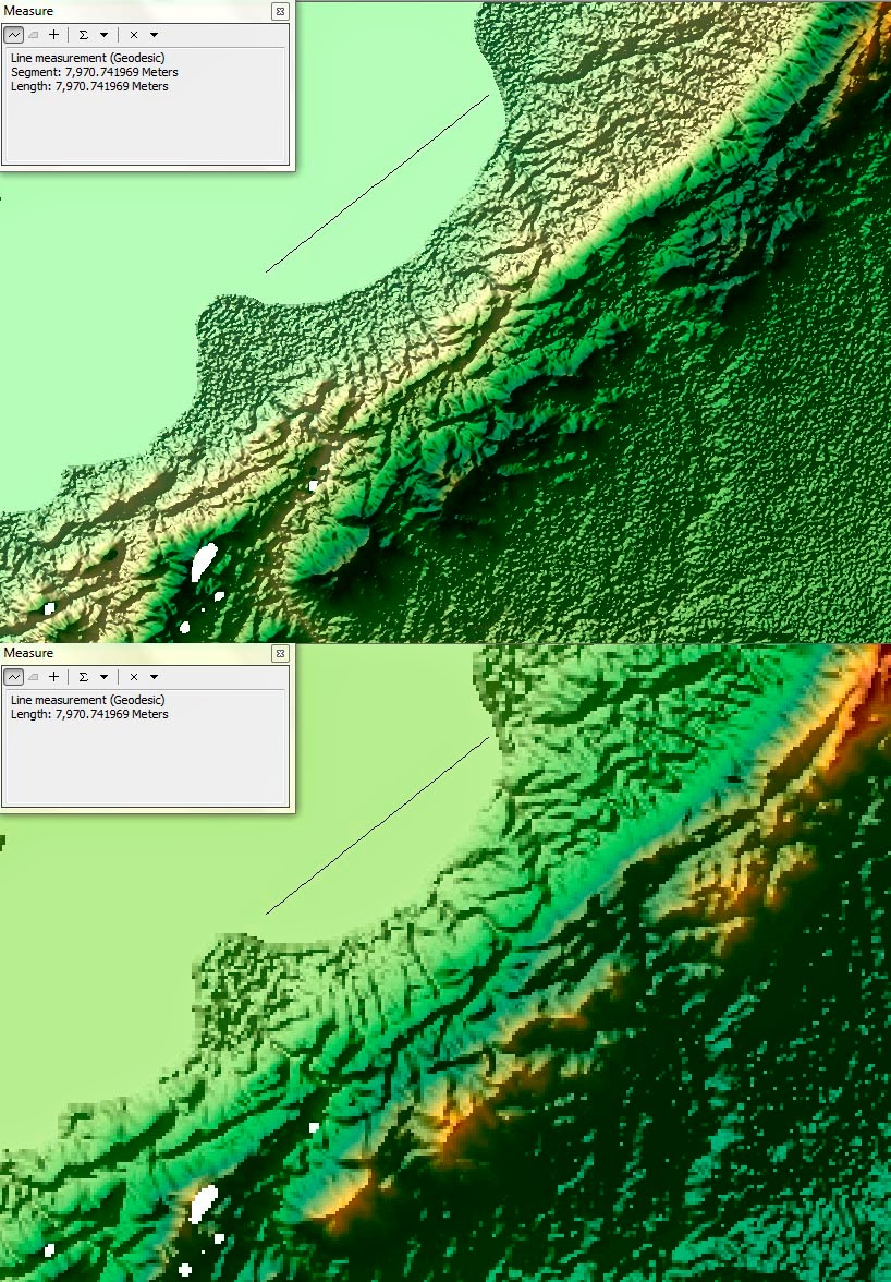
The image below compares the two datasets. The top image is the new SRTM data released yesterday and the bottom is the older, lower resolution data. The diagonal line drawn through the top middle is about 7.97km long. There are still a few gaps in the new 30 m DEMs, but on a regional scale, there are far fewer than in the 90 m DEMs. Look how crisp and detailed the shoreline is now.
Not only will my maps look better with the newer DEMs, it is easier to find the onshore border faults of the rift basin with the higher resolution data (hint: I'm pretty sure one runs right through this image, approximately parallel to, and southeast of, the line I drew for a scale reference).
This morning I downloaded the new data for the Lake Malawi region from the USGS Earth Explorer and created a new raster image. I use a technique posted in an ESRI blog to create pansharpened images. Essentially, this drapes the tinted elevation file over a hillshade, creating an image that shows relief without the need for making any layers transparent.
The image below compares the two datasets. The top image is the new SRTM data released yesterday and the bottom is the older, lower resolution data. The diagonal line drawn through the top middle is about 7.97km long. There are still a few gaps in the new 30 m DEMs, but on a regional scale, there are far fewer than in the 90 m DEMs. Look how crisp and detailed the shoreline is now.
![]() |
| Top: 30 m SRTM. Bottom: 90m SRTM. North at the top. Click to embiggen. |
Not only will my maps look better with the newer DEMs, it is easier to find the onshore border faults of the rift basin with the higher resolution data (hint: I'm pretty sure one runs right through this image, approximately parallel to, and southeast of, the line I drew for a scale reference).
Monday, September 22, 2014
Reefs in central New York
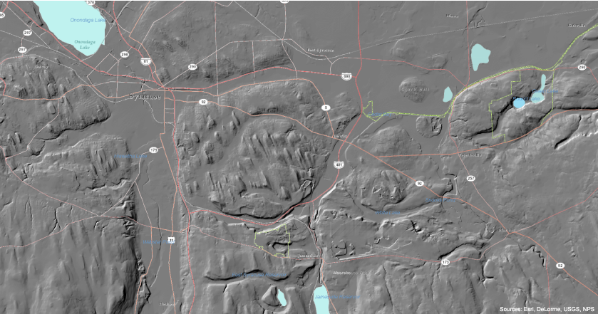
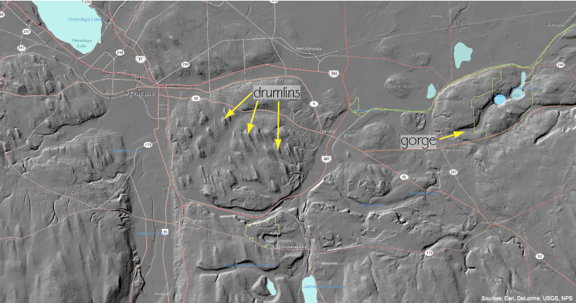
I've written about this type of hillshade map before, in my post "Hillshades of New York State." That post includes a link to a discussion about drumlins, which are abundant in this part of New York State.
![]() |
| Same map, but with some of the drumlins and the gorge marked. |
Green Lake and Round Lake are small and deep - the gorge they are in was formed by a river and these two lakes may have been plunge pools at the base of large waterfalls (similar to Niagara Falls and the Niagara River Gorge today).
![]() |
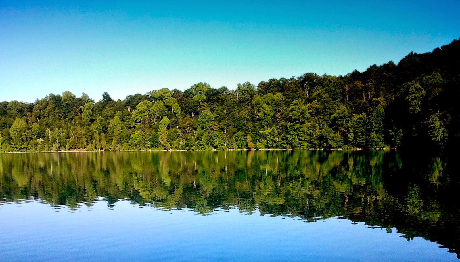
| Green Lake in summer (Tannis McCartney, 2012) |
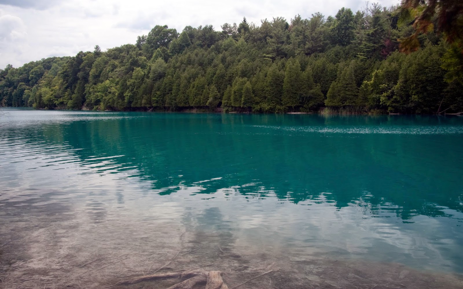
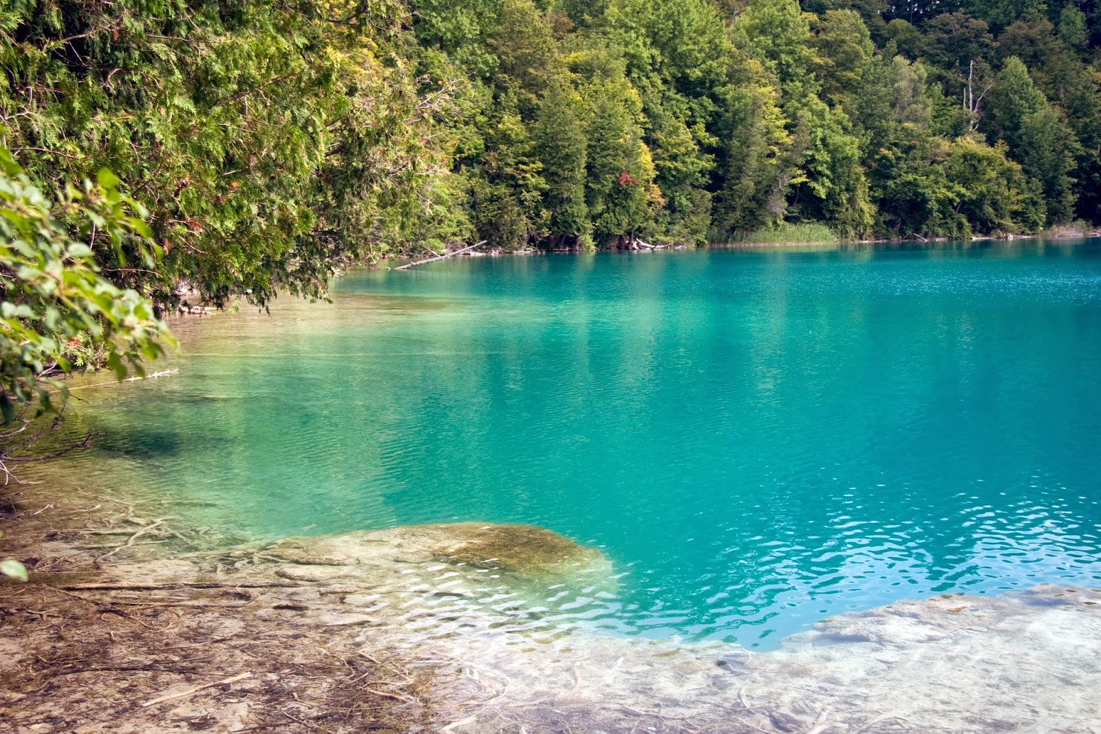
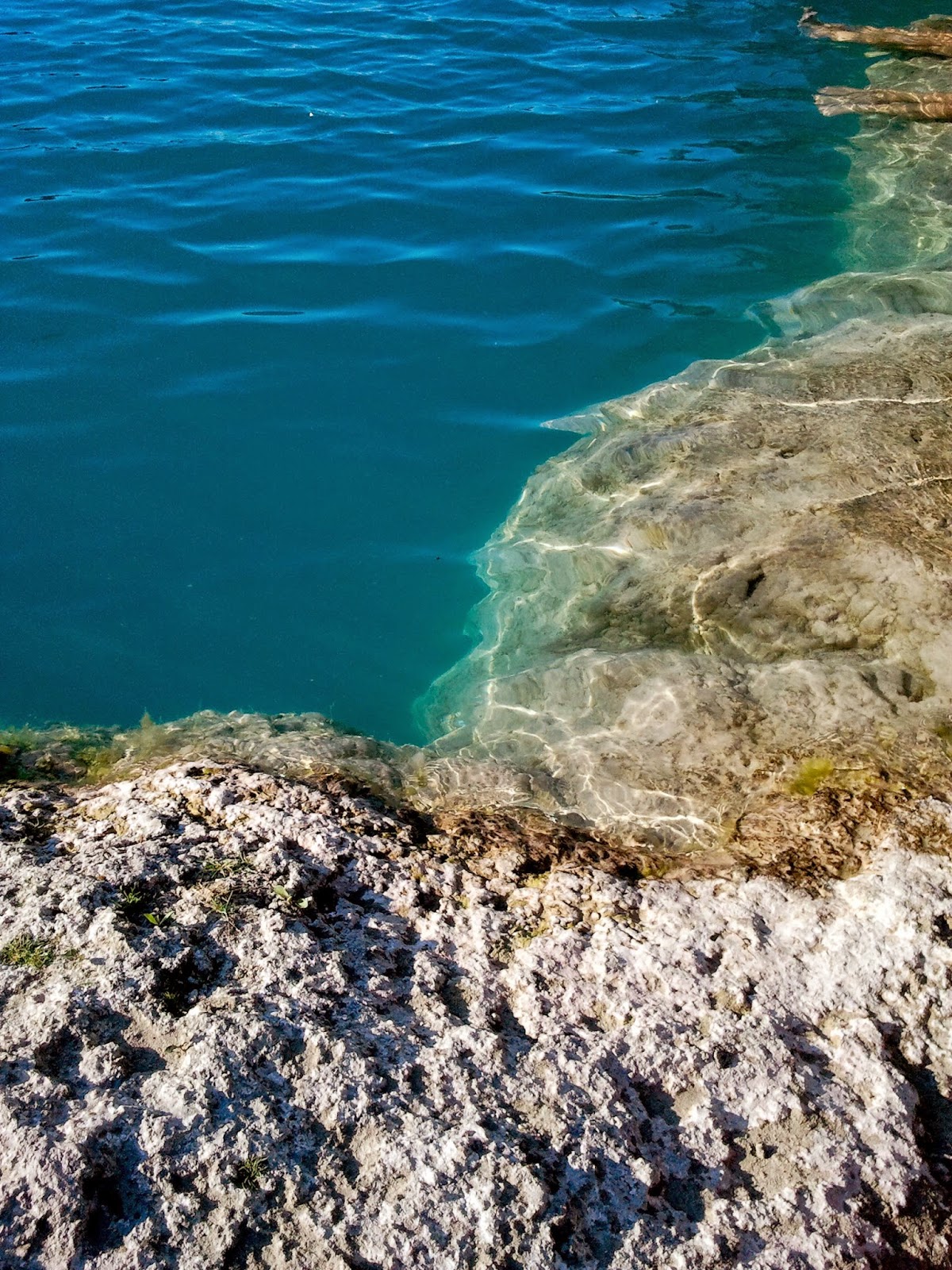
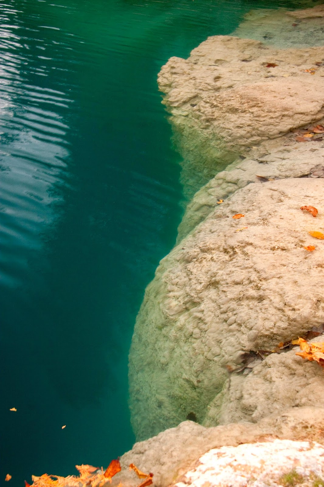
The lakes are surrounded by trees, but that's not how Green Lake (and the park) got its name. The name comes from the green colour of the water, which is a result of the the dissolved minerals brought into the lakes by rain and snow (particularly magnesium and calcium).
![]() |
| The distinctive colour that gives Green Lake its name (Tannis McCartney, 2014) |
![]() |
| The distinctive colour that gives Green Lake its name (Tannis McCartney, 2014) |
![]() |
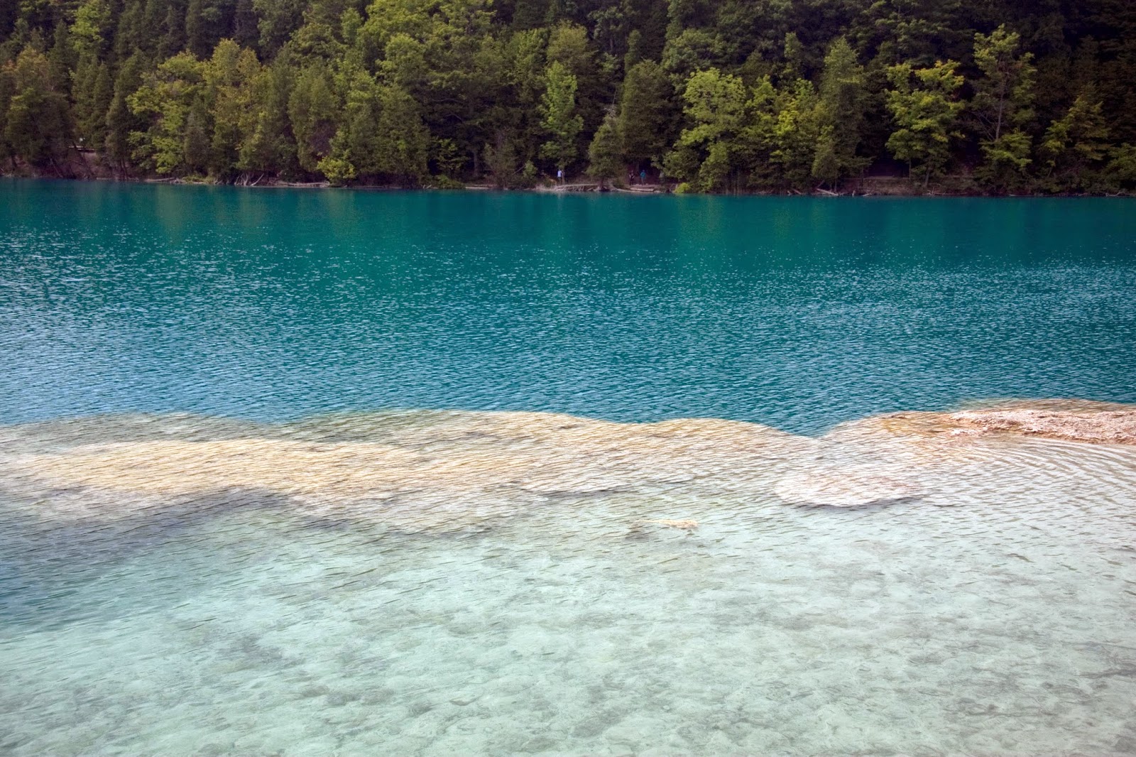
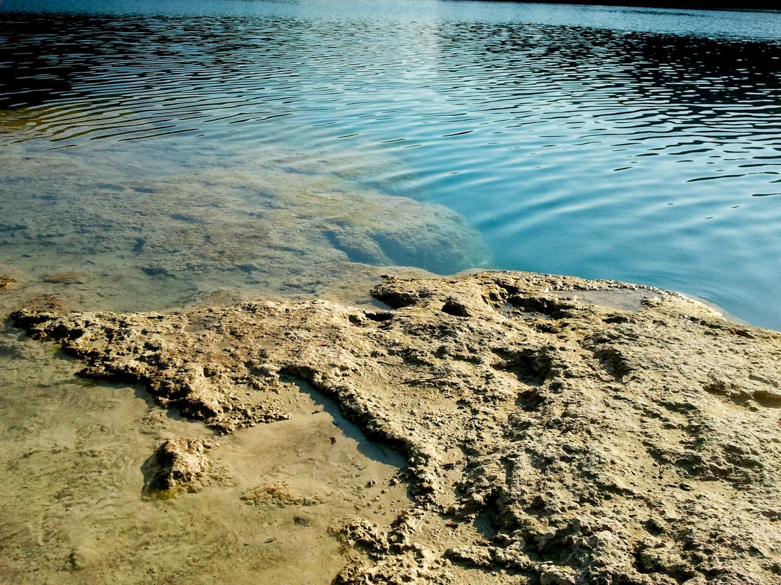
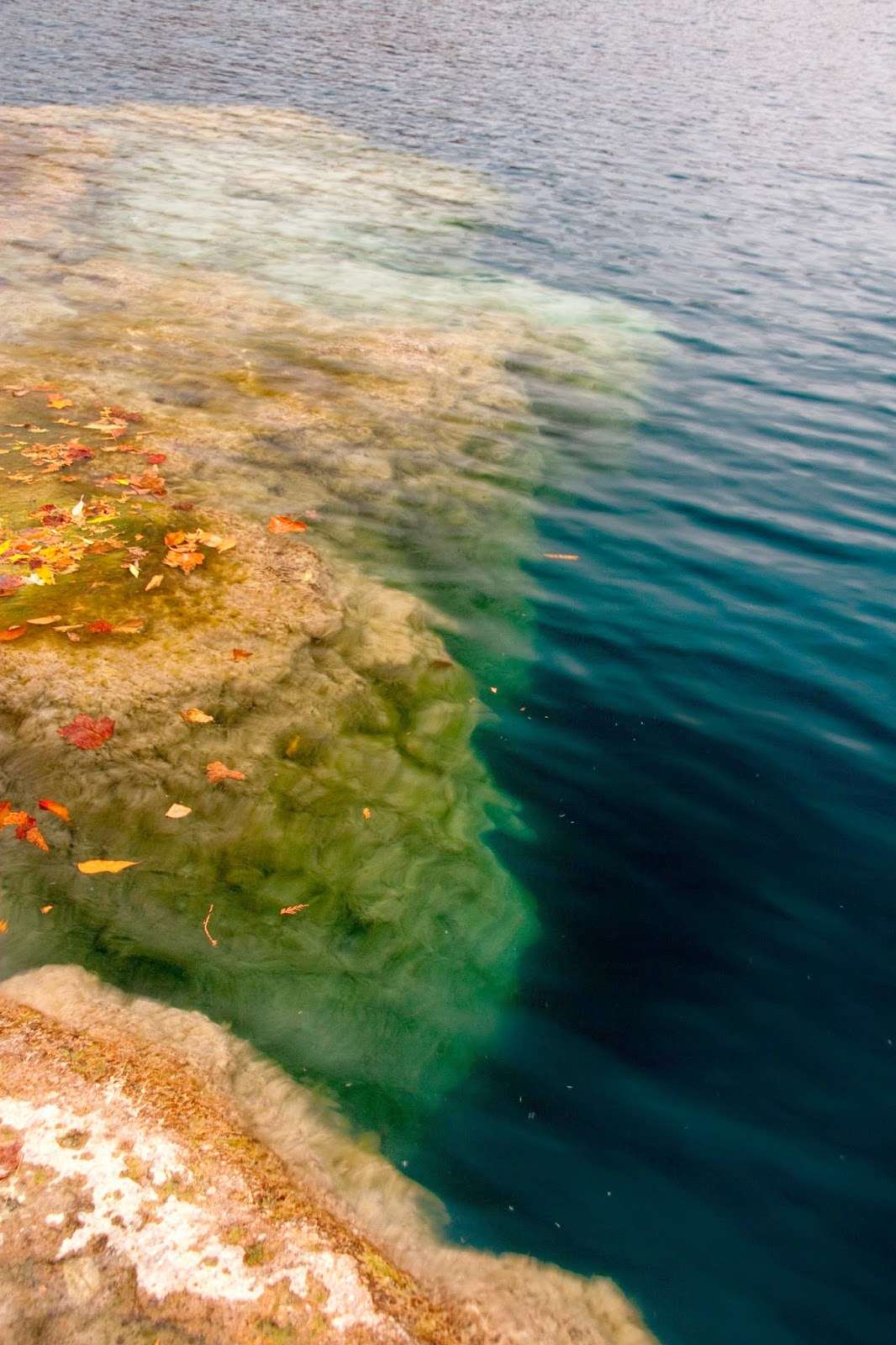
| Microbial mat extending into the lake (Tannis McCartney, 2014) |
![]() |
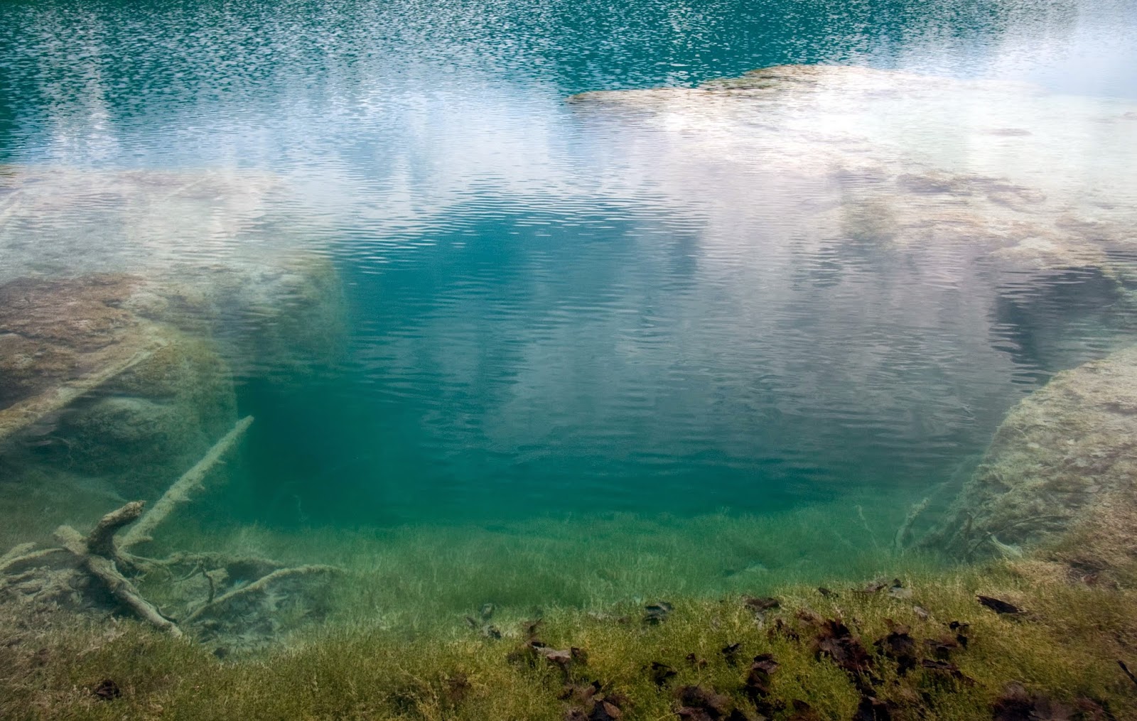
| "Reef" at Dead Man's Point (Tannis McCartney, 2012) |
![]() |
| When the lake is low, you can step out onto the tops of the reef. This is permitted, but going in the water isn't. (Tannis McCartney, 2012) |
![]() |
| Tannis McCartney, 2014 |
![]() |
| Tannis McCartney, 2012 |
![]() |
| Tannis McCartney, 2012 |
![]() |
| Tannis McCartney, 2012 |
Access to the reefs is restricted, in order to protect them, but you can watch a video taken with an ROV (remote-operated-vehicle) here: (The Underwater World of Green Lakes). The video is part of the research by Dr. Mark Teece and his biogeochemstry group at SUNY-ESF, which is right next door to SU.
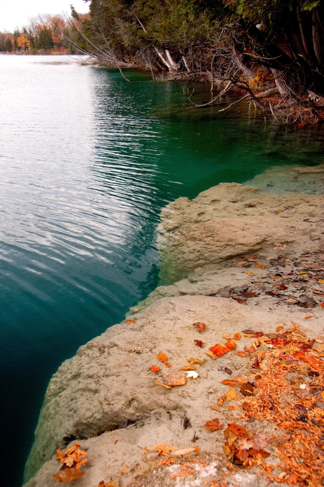
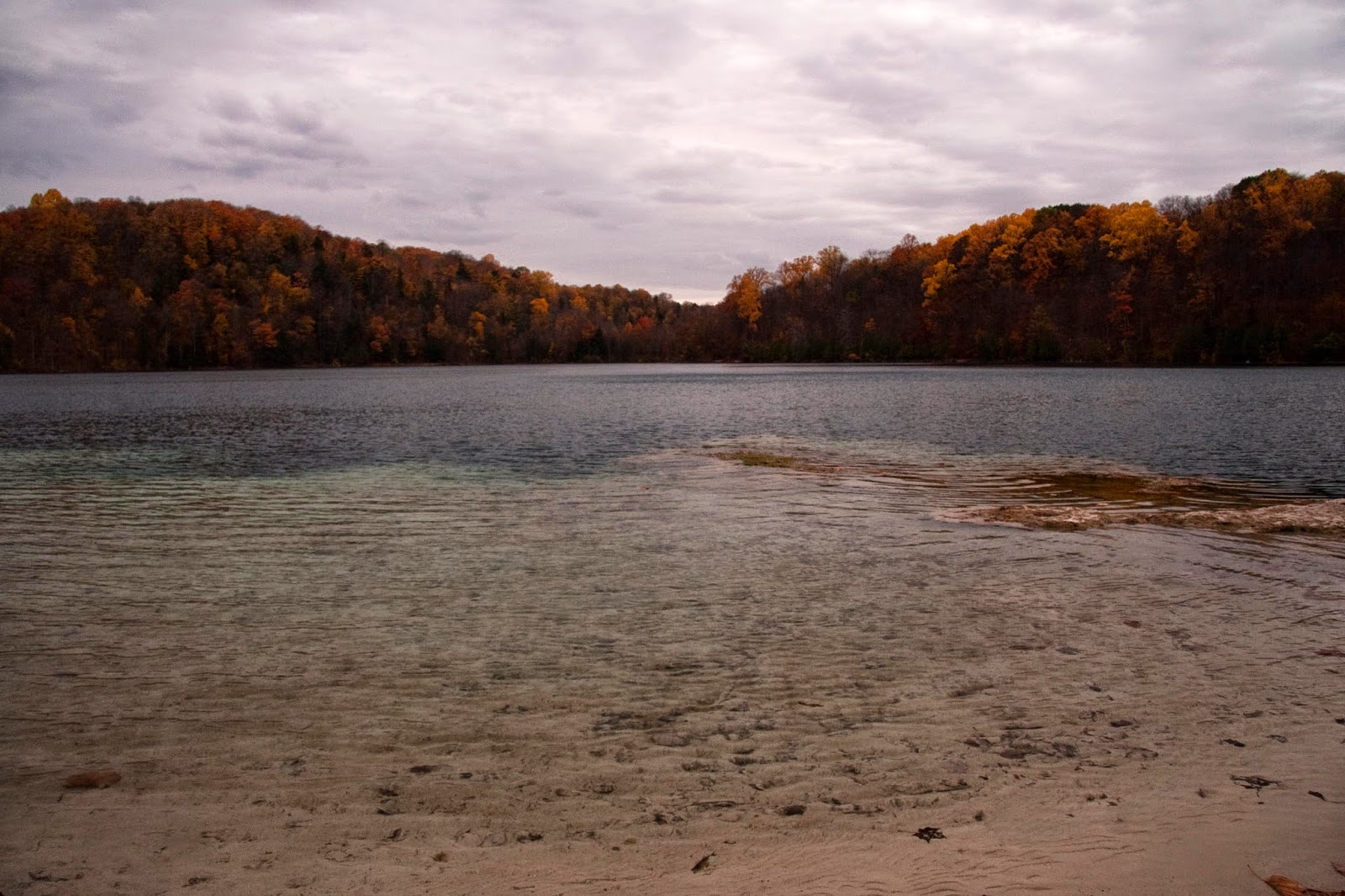
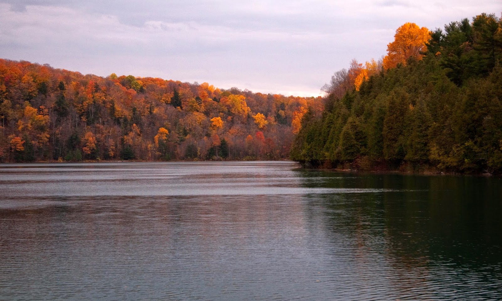
Green Lakes State Park is not just for summer cookouts and swimming. In the autumn it is a great place to see the changing leaves in the old-growth forests, and the trails are popular with cross-country skiers and snowshoers in the winter.
![]() |
| Green Lake in the autumn (Tannis McCartney, 2012) |
![]() |
| Green Lake in the autumn (Tannis McCartney, 2012) |
![]() |
| Round Lake in the autumn (Tannis McCartney, 2012) |
![]() |
| Tannis McCartney, 2012 |
![]() |
| Tannis McCartney, 2012 |
![]() |
| Tannis McCartney, 2012 |
References:
Thompson, J., Ferris, F., and Smith, D., 1990, Geomicrobiology and sedimentology of the mixolimnion and chemocline in Fayetteville Green Lake, New York: Palaios, v. 5, no. 1, p. 52–75.
Tuesday, June 3, 2014
The difference between latitude and longitude
I've loved maps for as long as I can remember, but it took me years to figure out a way to remember which was which when it came to latitude and longitude. Here's the handy picture I always remember now:
![]() |
| Lines of latitude pass through the crosses of the t's in the word latitude. Lines of longitude pass through the g in the word longitude. |
Saturday, May 31, 2014
Friday night pie-ence
Friday nights tend to be one of the most productive times of the week for me. It probably has to do with being able to relax and stop thing about to-do lists and just focus on making figures or writing R scripts, or thinking through problems.
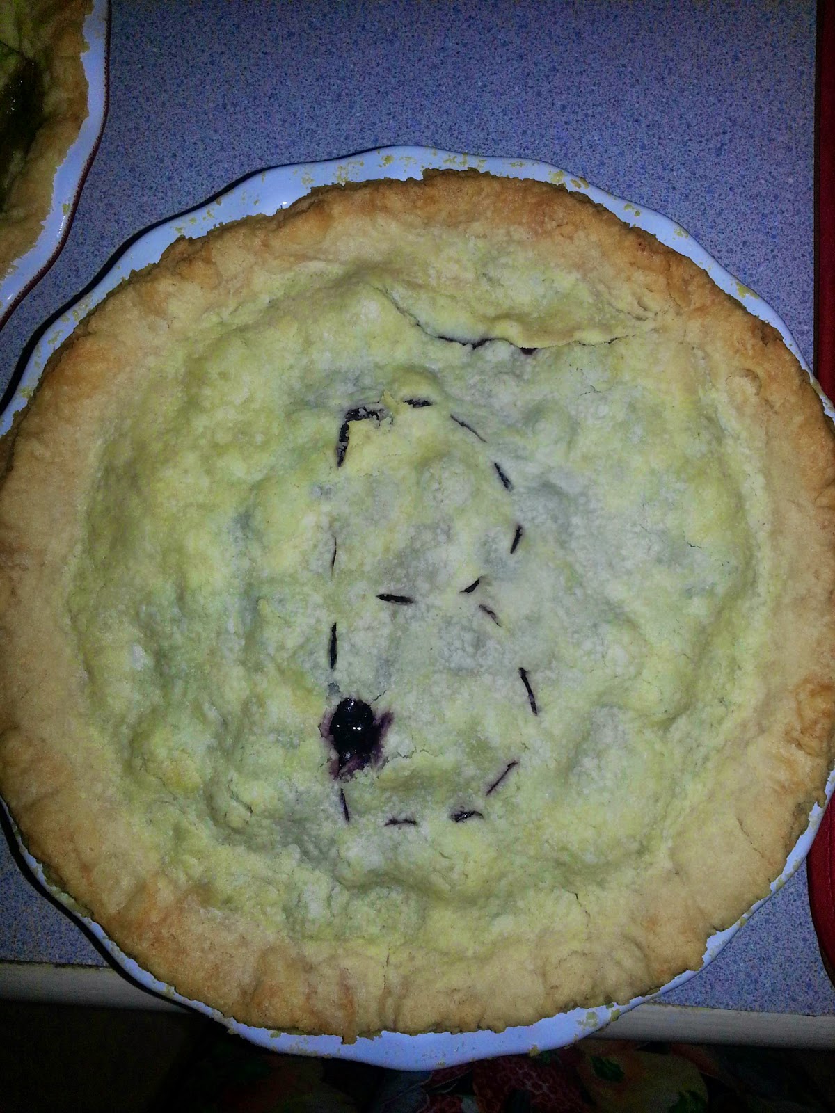
Last night, however, instead of my usual Friday night science, I baked pies for an backyard chicken fry-up one of the other grad students in my department is hosting.
As I was baking, I couldn't help but think of geology analogies for my pies (which I like to think of as "pie-ence":
![]() |
| My pastry recipe (handed down from my mother) makes three pies. The top one is lemon meringue and on the bottom are blueberry and apple pies. |
Friday, May 9, 2014
You can put your finger on it
My blog has been on hiatus for several months as I prepared for my qualification exam. Even the sporadic posting I'd been doing had to go on hold, as all my energy went into staying sane during the long hours of proposal writing, literature review, and studying (mixed in with TA duties and taking one class "for fun").
The geological record is full of hiatus' too, just like my blog. My stratigraphy professor in undergrad often reminded us that the geological record is "more gap than record."
We call these gaps in the record unconformities, and the gap in time is something you can put your finger on. I've posted two photos of unconformities on this blog before:
The unconformity at Red Rocks Amphitheater in Colorado and
An unconformity in the front ranges of the Canadian Rocky Mountains
On a recent field trip, I was able to put my finger on yet another unconformity, this time in upstate New York, between Cambrian Potsdam Sandstone (with a pebble/cobble lag at the base) and Proterozoic gneiss beneath.
Unconformities in the rock record are the result of erosion or non-deposition. There are four main types of unconformity (click for a bigger version of the figure below):
The photo above, from upstate New York, shows a nonconformity. The unconformity in Colorado that I've posted about previously is also a nonconformity. The Canadian Rockies example I linked to above is a disconformity.
While you may be able to put your finger on an unconformity when you're standing at an outcrop, if you look at a stratigraphic record, you can see how big the gaps in time are. The figure below is a temporal record of my blog posts, where each purple line is a blog post. Just like the actual record, my blog has more gaps than record. Thicker lines are actually closely-spaced lines that represent small time intervals where I had lots of blog posts (five days in a row, for example). I've taken the liberty of naming the biggest unconformities in my record.
My qualification exam was on April 16th, and I passed. I did get to go on an awesome four-day field trip the following week, but most of the time I've spent since my exam has been grading and giving my students extra office hours to make up for how little I was able to do for them in the week or two before my exam. I still feel like I'm recovering, and I'm not feeling very motivated to dive back into research yet.
During my blog hiatus, I've thought a lot about why I keep this blog, both what I want to get out of it for myself, and what I want others to get from it. I have a really cool research project, but working on it is not always fun and inspiring. This blog is a chance for me to step back from that and post about the things I think are cool and fun and inspiring in geoscience. I have a big list of posts I'd like to do, ranging from field trips I've been on to background for my research, and some ideas about teaching geoscience too. If you keep reading, I hope you'll find my posts cool, fun, and inspiring too.
The geological record is full of hiatus' too, just like my blog. My stratigraphy professor in undergrad often reminded us that the geological record is "more gap than record."
We call these gaps in the record unconformities, and the gap in time is something you can put your finger on. I've posted two photos of unconformities on this blog before:
The unconformity at Red Rocks Amphitheater in Colorado and
An unconformity in the front ranges of the Canadian Rocky Mountains
On a recent field trip, I was able to put my finger on yet another unconformity, this time in upstate New York, between Cambrian Potsdam Sandstone (with a pebble/cobble lag at the base) and Proterozoic gneiss beneath.
Unconformities in the rock record are the result of erosion or non-deposition. There are four main types of unconformity (click for a bigger version of the figure below):
The photo above, from upstate New York, shows a nonconformity. The unconformity in Colorado that I've posted about previously is also a nonconformity. The Canadian Rockies example I linked to above is a disconformity.
While you may be able to put your finger on an unconformity when you're standing at an outcrop, if you look at a stratigraphic record, you can see how big the gaps in time are. The figure below is a temporal record of my blog posts, where each purple line is a blog post. Just like the actual record, my blog has more gaps than record. Thicker lines are actually closely-spaced lines that represent small time intervals where I had lots of blog posts (five days in a row, for example). I've taken the liberty of naming the biggest unconformities in my record.
My qualification exam was on April 16th, and I passed. I did get to go on an awesome four-day field trip the following week, but most of the time I've spent since my exam has been grading and giving my students extra office hours to make up for how little I was able to do for them in the week or two before my exam. I still feel like I'm recovering, and I'm not feeling very motivated to dive back into research yet.
During my blog hiatus, I've thought a lot about why I keep this blog, both what I want to get out of it for myself, and what I want others to get from it. I have a really cool research project, but working on it is not always fun and inspiring. This blog is a chance for me to step back from that and post about the things I think are cool and fun and inspiring in geoscience. I have a big list of posts I'd like to do, ranging from field trips I've been on to background for my research, and some ideas about teaching geoscience too. If you keep reading, I hope you'll find my posts cool, fun, and inspiring too.
Thursday, January 30, 2014
Physicists do it all the time
Physicists do it all the time, and so should geologists and engineers.
I'm talking about dimensional analysis. As a student in a physics department (which I was, for my undergrad degree in geophysics), it is required as part of "showing your work" but it also helps you figure out which formulas and equations to use if you're stuck.
Dimensional analysis is a tool to keep track of the units when you are doing calculations with physical properties. If you have an equation that involves measured values, the units on both sides of the equation must add up. If you manipulating an equation in any way, such as substituting in other equations, or rearranging it to solve for an important variable, you should do the dimensional analysis before you start plugging in your numbers.
If you are working with Darcy's Law, or Newton's Law of Universal Gravitation, or any other number of equations that involve measurements of physical parameters, the first step to making sure your work is correct should always be dimensional analysis. Do this on a piece of paper, before you start plugging things in to a spreadsheet or script/code.
Here's an example using Newton's Law of Universal Gravitation, for calculating the gravitational force between two bodies:
1. Create a "legend" of the variables in your equation, defining them and the units they are measured in:
2. Plug the units into the equation instead of the variables:
3. We can rearrange this a little bit, and cancel things out, leaving Newtons on both sides of the equation:
As long as the values you have are input in Newtons, kilograms, and meters, you will correctly calculate the gravitational force, in Newtons, between two objects.
Notice that there are no values in the dimensional analysis (steps 2-3). Dimensional analysis should never include values.
Last semester, my students had to do two labs where they made some lab measurements and then did some calculations using those measurements in Excel. They struggled with this concept a lot in the first one. A few weeks later, when it was time for the second lab like this, I included teaching them to do dimensional analysis before plugging things into Excel. It made a world of a difference in how well they did with the rest of the lab.
I'm talking about dimensional analysis. As a student in a physics department (which I was, for my undergrad degree in geophysics), it is required as part of "showing your work" but it also helps you figure out which formulas and equations to use if you're stuck.
Dimensional analysis is a tool to keep track of the units when you are doing calculations with physical properties. If you have an equation that involves measured values, the units on both sides of the equation must add up. If you manipulating an equation in any way, such as substituting in other equations, or rearranging it to solve for an important variable, you should do the dimensional analysis before you start plugging in your numbers.
If you are working with Darcy's Law, or Newton's Law of Universal Gravitation, or any other number of equations that involve measurements of physical parameters, the first step to making sure your work is correct should always be dimensional analysis. Do this on a piece of paper, before you start plugging things in to a spreadsheet or script/code.
Here's an example using Newton's Law of Universal Gravitation, for calculating the gravitational force between two bodies:
1. Create a "legend" of the variables in your equation, defining them and the units they are measured in:
- Fg is the gravitational force (in Newtons)
- m1 and m2 are masses of the two bodies (in kilograms)
- d is the distance between the two bodies (in meters)
- and G is the gravitational constant:
3. We can rearrange this a little bit, and cancel things out, leaving Newtons on both sides of the equation:
As long as the values you have are input in Newtons, kilograms, and meters, you will correctly calculate the gravitational force, in Newtons, between two objects.
Notice that there are no values in the dimensional analysis (steps 2-3). Dimensional analysis should never include values.
Last semester, my students had to do two labs where they made some lab measurements and then did some calculations using those measurements in Excel. They struggled with this concept a lot in the first one. A few weeks later, when it was time for the second lab like this, I included teaching them to do dimensional analysis before plugging things into Excel. It made a world of a difference in how well they did with the rest of the lab.
Monday, December 2, 2013
Plotting Geologic Time in R
I'm going to be plotting some data in R, with geologic age along the y-axis, so I thought it would be nice to have a version of the timescale to go with it. In order to plot everything with the same y-axis, I need the Cenozoic timescale as a stacked bar chart R.
The first step was creating a table with the information I needed. I created a comma-separated file that I loaded into R. My file had four columns: Time (a text column where I listed the Epochs), AgeStart (the beginning of each epoch), AgeEnd (the end of each epoch) and Duration (the length of each epoch).
In R, I'm using the ggplot2 library (and for what it's worth, I use RStudio). To begin with:
ggplot(data = Cenozoic, aes(x= "Epoch", y = Duration, fill = Time))
This plots the data in the Cenozoic table with "Epoch" on the x-axis, Duration on the y-axis, and using Time to fill the bars with different colours. Epoch is not something I had in the input table - to create a single stacked bar chart you want only one x value and it has to be assigned a value/string. I called it Epoch. By using Duration along the y-axis, it creates the stacked bars of the appropriate widths, and it fills the colours according to the Time column.
ylab("Ma") + xlab(NULL)
This sets the labels for the x- and y- axes. I didn't need an x-axis label since the tick will be labeled with Epoch based on my inputs above.
geom_bar(stat="identity")
This tells R to create bars with heights that represent specific values (in this case, the duration of the epoch).
geom_text(label = Cenozoic$Time, aes(y=midpoint, ymax=65.5))
This puts the epoch labels in the center of each bar. The midpoint values calculated earlier are used here.
theme(legend.position="none")
This turns off the legend, since the labels have been applied to the bars directly.
scale_fill_manual(values=c("#FEF2E0", "#FFF2AE", "#FFFF99", "#FFFF00", "#FDC07A", "#F3B46C", "#FDA75F"))
This sets the hex colour values for each bar. I decided to go all out here - I used the "official" colours for the International Time Scale. I got the RGB values for each epoch from this handy resource at Purdue. I'm not sure if R can handle RGB values, but I know it can take hex colours, so I converted the RGB values for the epochs to hex using an online converter. There may be a more efficient way to do this, and if I was working with more than seven rows of data, I would have spent a bit of time finding it. However, this works for the Cenozoic epochs. This command creates a column that assigns the colours to the bars in the same order they are plotted.
Since my plan is to tile this with other data I'm plotting, I'm leaving off the title for now. Eventually I will make this narrower too. Once I have everything else scripted in R, I'll decide whether or not to flip the y-axis or rotate the whole plot, but for now I'm pretty pleased with the results:
The first step was creating a table with the information I needed. I created a comma-separated file that I loaded into R. My file had four columns: Time (a text column where I listed the Epochs), AgeStart (the beginning of each epoch), AgeEnd (the end of each epoch) and Duration (the length of each epoch).
In R, I'm using the ggplot2 library (and for what it's worth, I use RStudio). To begin with:
The next step was to calculate the midpoint of each epoch.# Script created by Tannis McCartney
library(ggplot2)
# Read in time scale file (Ages from 2013 International Time Scale)
Cenozoic <- read.csv(file='Cenozoic.csv')
I also needed to tell R which order to put my epochs in. For a larger dataset, I would probably create a sequential numerical column, but with only seven epochs in the Cenozoic, I could spell it out:midpoint <- Cenozoic$Age.End + Cenozoic$Duration/2
Cenozoic$Time <- factor(Cenozoic$Time, levels = c("Holocene", "Pleistocene", "Pliocene", "Miocene", "Oligocene", "Eocene", "Paleocene"))
With ggplot2, the plot is generated by a series of commands added together:
Let me break that down a bit:ggplot(data = Cenozoic, aes(x= "Epoch", y = Duration, fill = Time)) + ylab("Ma") + xlab(NULL) + geom_bar(stat="identity") + geom_text(label = Cenozoic$Time, aes(y=midpoint, ymax=65.5)) + theme(legend.position="none") + scale_fill_manual(values=c("#FEF2E0", "#FFF2AE", "#FFFF99", "#FFFF00", "#FDC07A", "#F3B46C", "#FDA75F"))
ggplot(data = Cenozoic, aes(x= "Epoch", y = Duration, fill = Time))
This plots the data in the Cenozoic table with "Epoch" on the x-axis, Duration on the y-axis, and using Time to fill the bars with different colours. Epoch is not something I had in the input table - to create a single stacked bar chart you want only one x value and it has to be assigned a value/string. I called it Epoch. By using Duration along the y-axis, it creates the stacked bars of the appropriate widths, and it fills the colours according to the Time column.
ylab("Ma") + xlab(NULL)
This sets the labels for the x- and y- axes. I didn't need an x-axis label since the tick will be labeled with Epoch based on my inputs above.
geom_bar(stat="identity")
This tells R to create bars with heights that represent specific values (in this case, the duration of the epoch).
geom_text(label = Cenozoic$Time, aes(y=midpoint, ymax=65.5))
This puts the epoch labels in the center of each bar. The midpoint values calculated earlier are used here.
theme(legend.position="none")
This turns off the legend, since the labels have been applied to the bars directly.
scale_fill_manual(values=c("#FEF2E0", "#FFF2AE", "#FFFF99", "#FFFF00", "#FDC07A", "#F3B46C", "#FDA75F"))
This sets the hex colour values for each bar. I decided to go all out here - I used the "official" colours for the International Time Scale. I got the RGB values for each epoch from this handy resource at Purdue. I'm not sure if R can handle RGB values, but I know it can take hex colours, so I converted the RGB values for the epochs to hex using an online converter. There may be a more efficient way to do this, and if I was working with more than seven rows of data, I would have spent a bit of time finding it. However, this works for the Cenozoic epochs. This command creates a column that assigns the colours to the bars in the same order they are plotted.
Since my plan is to tile this with other data I'm plotting, I'm leaving off the title for now. Eventually I will make this narrower too. Once I have everything else scripted in R, I'll decide whether or not to flip the y-axis or rotate the whole plot, but for now I'm pretty pleased with the results:
Monday, November 11, 2013
Sedimentary Petrology
I was doing really well with my 30 minutes of blogging per day, right up until the class I TA started the 4-week section on sedimentary petrology. Prior to teaching these labs, I hadn't looked at a thin section since the nineties, and even then I was terrible at it. So I've had to devote a huge chunk of my time to re-learning how to use an optical microscope and the fundamentals of sedimentary petrology. Not that this is a bad thing to review-- I've always been very self-conscious about my level of comfort with a thin section.
I've kept these labs very basic, because about 2/3 of my students haven't even taken mineralogy yet. No measuring angles of extinction, no interference color charts, just visual differentiation between a few key minerals, sedimentary textures, provenance, and diagenesis.
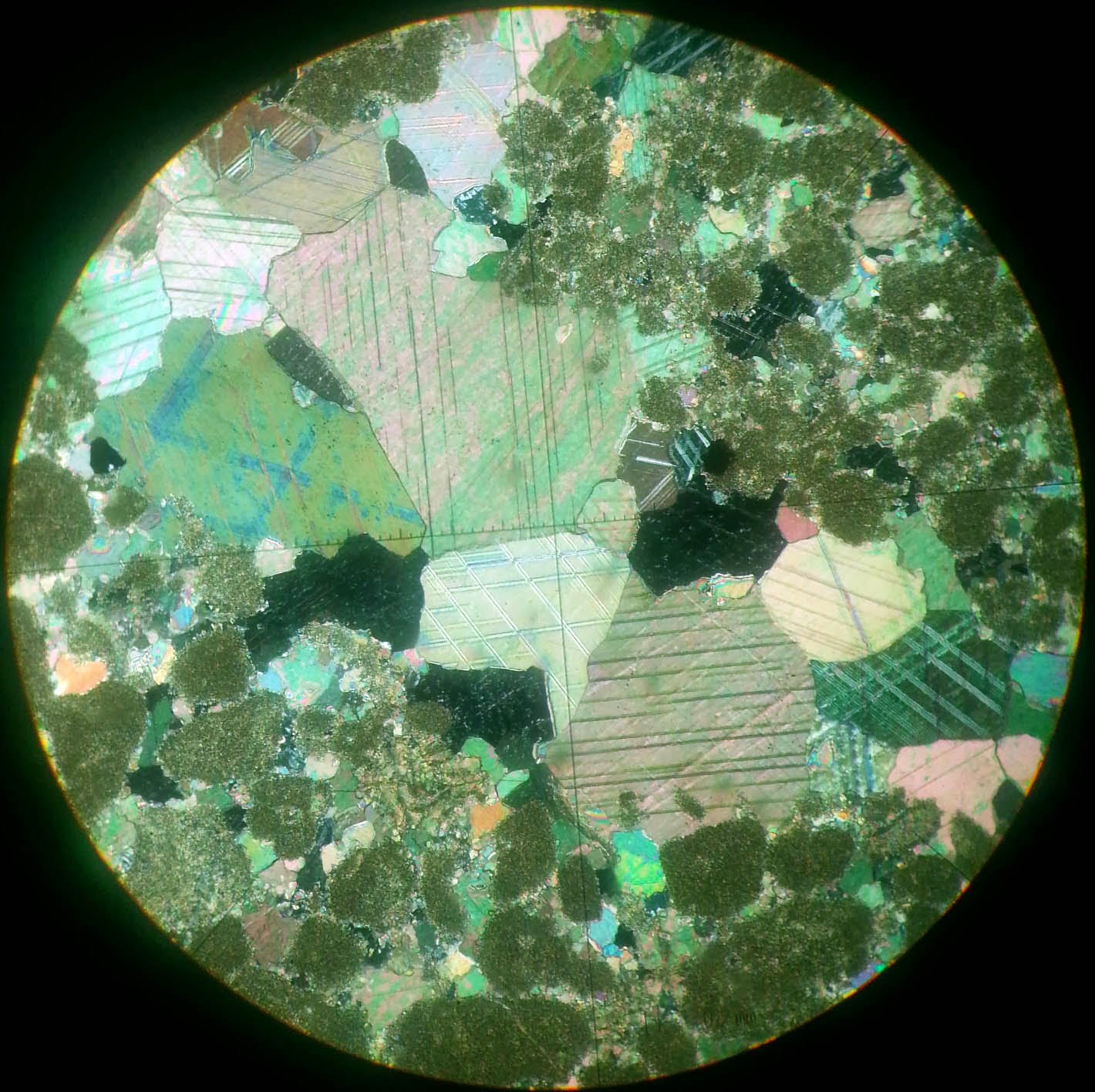
Rather than dig out the department camera that goes with the microscope (it was getting a lot of use in October as people prepared for GSA), I used my smartphone camera to get photos of some of the slides we were using in lab. It's tricky, and the photos aren't high quality, but they are good enough for learning and for reviewing the slides with the students. Here are a few of my favorite thin section photos from the last month or so of teaching. Most of these are at 4x magnification. A few are at 10x magnification.
I've kept these labs very basic, because about 2/3 of my students haven't even taken mineralogy yet. No measuring angles of extinction, no interference color charts, just visual differentiation between a few key minerals, sedimentary textures, provenance, and diagenesis.
Rather than dig out the department camera that goes with the microscope (it was getting a lot of use in October as people prepared for GSA), I used my smartphone camera to get photos of some of the slides we were using in lab. It's tricky, and the photos aren't high quality, but they are good enough for learning and for reviewing the slides with the students. Here are a few of my favorite thin section photos from the last month or so of teaching. Most of these are at 4x magnification. A few are at 10x magnification.
![]() |
| Glauconite under XPL |
![]() |
| Glauconite under PPL |
![]() |
| Precambrian impactite? Great examples of feldspar twinning here. |
![]() |
| Tahitian black beach sand (mostly olivine) |
![]() |
| Silicified oolite under XPL, with calcite exhibiting twinning. |
![]() |
| The same silicifed oolite under PPL. The calcite is showing beautiful rhombohedral cleavage. |
![]() |
| Dolostone under PPL |
![]() |
| The same dolostone under XPL |
![]() |
| Oolitic Limestone under PPL |
![]() |
| I don't remember which sample this photo is from (I think it's a carbonate). I assume this is some sort of recrystallization. Please feel free to comment if you know otherwise. |
Monday, October 14, 2013
Seashells, and not at the ocean
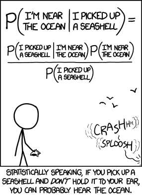
I was inspired to write this entry by an xkcd comic:
Lake Turkana is a saltwater lake, and it used to be much larger than it is now. The photo below is of a rock I picked up en route to our drilling site in northern Turkana. We were stopped for at least an hour because the truck carrying our equipment got stuck. There wasn't anything I could add to the effort to get it out so I had a bit of time to explore the piles of rocks that were carried downstream when water flooded the laga. Because it was found in the riverbed, I don't know very much about it, except that it originated upstream from where I was in ancient deposits.
If you haven't seen this one, the mouseover text is what really made me laugh:
"This is roughly equivalent to 'number of times I've picked up a seashell at the ocean' / 'number of times I've picked up a seashell,' which in my case is pretty close to one and gets closer if we're considering only times I didn't put it to my ear."I collected a few seashells in Turkana, in the dry lagas (riverbeds). I was nowhere near the ocean, and I was several kilometers away from the modern lake. But once upon a time...
Lake Turkana is a saltwater lake, and it used to be much larger than it is now. The photo below is of a rock I picked up en route to our drilling site in northern Turkana. We were stopped for at least an hour because the truck carrying our equipment got stuck. There wasn't anything I could add to the effort to get it out so I had a bit of time to explore the piles of rocks that were carried downstream when water flooded the laga. Because it was found in the riverbed, I don't know very much about it, except that it originated upstream from where I was in ancient deposits.
![]() |
| Seashells that are not from the sea |
![]() |
| If you look on the bottom left corner of the rock, there is a darker piece. That's a fish bone. |
Subscribe to:
Posts (Atom)