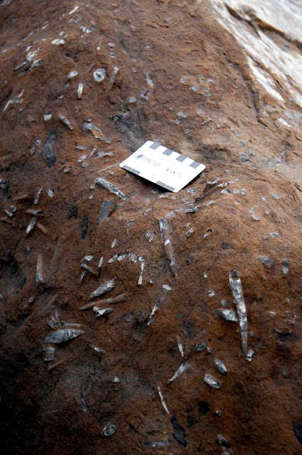
The photo that is currently the header in this blog is a cropped version of this one:
These rocks are Nordegg Member limestones and sandstones; part of the Jurassic Fernie Formation in west-central Alberta. Although I used mainly subsurface data for my MSc, I did spend a couple of days in the field looking at outcrop equivalents to the units I was studying. I can't say enough about how important this was for me to really be able to visualize relationships, both spatially and temporally.
I took this photo about a year into my MSc, and once I had it I started using it for presentations because I like it and it is relevant.
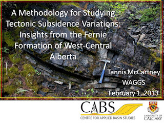
Every PowerPoint presentation I put together on my research has the same design. I didn't use the photo on posters, but I did use the same colours (the school colours) for outlining sections of my posters as I used for separators/outlines on my slides.
This photo is on the title slides, and a cropped version similar to the blog header is along the bottom of each slide. I use a "footer" on the bottom of PowerPoint slides because unless you are in an auditorium that slopes to the front, very few people will be able to see any content in that space.
I use the logos for my university and my research group on all of my slides. On a white background, the logos are in full colour, but on a coloured background, the logos are a single colour. Besides the fact that it looks better, some universities have rules about using their logos, and for my MSc school, this was one of them.
 |
| Sample title slide for my MSc research |
 |
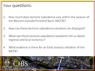
Sample text slide for my MSc research.
This is the most text I would ever put on a single slide. |
For the content, I use a white background with black text in the default font. The simpler, the better. The example I have here is a text slide, but it is one of very few that I put into my presentations. I try to minimize the text on the slides. Instead, I have arrows and circles to remind me what points I want to make about each slide. When I do have text, such as in the slide above, I make each bullet point appear (using the simplest animation possible) as I discuss it, so that the audience and I are going through the material at the same pace.
I try to keep my slides as simple as possible. I try only put content in the frame I've created with the slide design (i.e. no covering my beloved outcrop photo). Unless I'm directly comparing something on two different figures, I don't put figures on top of each other with animations. A new figure gets a new slide. If I do use animations, it is to make the annotations appear in the order I want to talk about them.
I never flip back through my slides during a presentation. It's too easy to get lost (for the presenter and the audience). If I want to show something again for emphasis, I make a duplicate of the slide and place the copy where I want to show it the second time. This also makes it easier to estimate the time I'll need based on the number of slides I have.
One of the exciting things (for me) about starting new research is getting to pick new designs for presenting my work. I don't have field photos yet so I'm using maps and a scrap of unmarked seismic. I suspect I may end up with more than one design for my current research, because it is a bit broader than my MSc research was. The challenge fun part will be finding a way to tie the designs together in a cohesive way.
