Monday, December 2, 2013

Plotting Geologic Time in R

I'm going to be plotting some data in R, with geologic age along the y-axis, so I thought it would be nice to have a version of the timescale to go with it.  In order to plot everything with the same y-axis, I need the Cenozoic timescale as a stacked bar chart R.

The first step was creating a table with the information I needed. I created a comma-separated file that I loaded into R. My file had four columns: Time (a text column where I listed the Epochs), AgeStart (the beginning of each epoch), AgeEnd (the end of each epoch) and Duration (the length of each epoch).

In R, I'm using the ggplot2 library (and for what it's worth, I use RStudio). To begin with:
# Script created by Tannis McCartney
library(ggplot2)
# Read in time scale file (Ages from 2013 International Time Scale)
Cenozoic <- read.csv(file='Cenozoic.csv')
The next step was to calculate the midpoint of each epoch.
midpoint <- Cenozoic$Age.End + Cenozoic$Duration/2
I also needed to tell R which order to put my epochs in. For a larger dataset, I would probably create a sequential numerical column, but with only seven epochs in the Cenozoic, I could spell it out:
Cenozoic$Time <- factor(Cenozoic$Time, levels = c("Holocene", "Pleistocene", "Pliocene", "Miocene", "Oligocene", "Eocene", "Paleocene"))
With ggplot2, the plot is generated by a series of commands added together:
ggplot(data = Cenozoic, aes(x= "Epoch", y = Duration, fill = Time)) + ylab("Ma") + xlab(NULL) + geom_bar(stat="identity") + geom_text(label = Cenozoic$Time, aes(y=midpoint, ymax=65.5)) + theme(legend.position="none")  + scale_fill_manual(values=c("#FEF2E0", "#FFF2AE", "#FFFF99", "#FFFF00", "#FDC07A", "#F3B46C", "#FDA75F"))
Let me break that down a bit:

ggplot(data = Cenozoic, aes(x= "Epoch", y = Duration, fill = Time))
This plots the data in the Cenozoic table with "Epoch" on the x-axis, Duration on the y-axis, and using Time to fill the bars with different colours. Epoch is not something I had in the input table - to create a single stacked bar chart you want only one x value and it has to be assigned a value/string. I called it Epoch. By using Duration along the y-axis, it creates the stacked bars of the appropriate widths, and it fills the colours according to the Time column.

ylab("Ma") + xlab(NULL)
This sets the labels for the x- and y- axes. I didn't need an x-axis label since the tick will be labeled with Epoch based on my inputs above.

geom_bar(stat="identity")
This tells R to create bars with heights that represent specific values (in this case, the duration of the epoch).

geom_text(label = Cenozoic$Time, aes(y=midpoint, ymax=65.5))
This puts the epoch labels in the center of each bar. The midpoint values calculated earlier are used here.

theme(legend.position="none")
This turns off the legend, since the labels have been applied to the bars directly.

scale_fill_manual(values=c("#FEF2E0", "#FFF2AE", "#FFFF99", "#FFFF00", "#FDC07A", "#F3B46C", "#FDA75F"))
This sets the hex colour values for each bar. I decided to go all out here - I used the "official" colours for the International Time Scale. I got the RGB values for each epoch from this handy resource at Purdue. I'm not sure if R can handle RGB values, but I know it can take hex colours, so I converted the RGB values for the epochs to hex using an online converter. There may be a more efficient way to do this, and if I was working with more than seven rows of data, I would have spent a bit of time finding it. However, this works for the Cenozoic epochs. This command creates a column that assigns the colours to the bars in the same order they are plotted.

Since my plan is to tile this with other data I'm plotting, I'm leaving off the title for now. Eventually I will make this narrower too. Once I have everything else scripted in R, I'll decide whether or not to flip the y-axis or rotate the whole plot, but for now I'm pretty pleased with the results:


Monday, November 11, 2013

Sedimentary Petrology

I was doing really well with my 30 minutes of blogging per day, right up until the class I TA started the 4-week section on sedimentary petrology.  Prior to teaching these labs, I hadn't looked at a thin section since the nineties, and even then I was terrible at it.  So I've had to devote a huge chunk of my time to re-learning how to use an optical microscope and the fundamentals of sedimentary petrology. Not that this is a bad thing to review-- I've always been very self-conscious about my level of comfort with a thin section.

I've kept these labs very basic, because about 2/3 of my students haven't even taken mineralogy yet. No measuring angles of extinction, no interference color charts, just visual differentiation between a few key minerals, sedimentary textures, provenance, and diagenesis.

Rather than dig out the department camera that goes with the microscope (it was getting a lot of use in October as people prepared for GSA), I used my smartphone camera to get photos of some of the slides we were using in lab. It's tricky, and the photos aren't high quality, but they are good enough for learning and for reviewing the slides with the students. Here are a few of my favorite thin section photos from the last month or so of teaching. Most of these are at 4x magnification. A few are at 10x magnification.

Glauconite under XPL
Glauconite under PPL

Precambrian impactite? Great examples of feldspar twinning here.

Tahitian black beach sand (mostly olivine)
Silicified oolite under XPL, with calcite exhibiting twinning.

The same silicifed oolite under PPL.
The calcite is showing beautiful rhombohedral cleavage.


Dolostone under PPL
The same dolostone under XPL
Oolitic Limestone under PPL
I don't remember which sample this photo is from (I think it's a carbonate).
I assume this is some sort of recrystallization. Please feel free to comment if you know otherwise.

Monday, October 14, 2013

Seashells, and not at the ocean

I was inspired to write this entry by an xkcd comic:


If you haven't seen this one, the mouseover text is what really made me laugh:  
"This is roughly equivalent to 'number of times I've picked up a seashell at the ocean' / 'number of times I've picked up a seashell,' which in my case is pretty close to one and gets closer if we're considering only times I didn't put it to my ear."
I collected a few seashells in Turkana, in the dry lagas (riverbeds). I was nowhere near the ocean, and I was several kilometers away from the modern lake. But once upon a time...

Lake Turkana is a saltwater lake, and it used to be much larger than it is now.  The photo below is of a rock I picked up en route to our drilling site in northern Turkana. We were stopped for at least an hour because the truck carrying our equipment got stuck. There wasn't anything I could add to the effort to get it out so I had a bit of time to explore the piles of rocks that were carried downstream when water flooded the laga. Because it was found in the riverbed, I don't know very much about it, except that it originated upstream from where I was in ancient deposits.

Seashells that are not from the sea
If you look on the bottom left corner of the rock, there is a darker piece. That's a fish bone.

Saturday, October 12, 2013

#standingwithDNLee

My personal 30 minute blog challenge, in which I spend 30 minutes a day writing blog posts, failed yesterday. I'm not beating myself up for this - I had a research deadline yesterday, and by the time I finished with that I was exhausted and couldn't keep my eyes open for 30 more minutes. 

Today, I'm asking you to take 30 minutes to catch up on what made my twitter feed explode in the last day: censorship used to silence a woman who called out someone for completely inappropriate behavior. 

Begin here, with an account of what happened (including the original post that has since been removed from its home): http://isisthescientist.com/2013/10/11/tell-someone-no-get-called-a-whore-standingwithdnlee-batsignal/

Then these posts which call out Scientific American for their appalling action (hopefully the ones hosted by Scientific American won't also be censored):


And finally, here, for a call to everyone to join in and "raise our voices":

Thursday, October 10, 2013

Look up!

I've posted before about the importance of looking up and around when you're out in the field. In 2012, on a field trip that crisscrossed a remote corner of Dinosaur Provincial Park and some of the private land surrounding it, I took the following two photos.

The red arrow in the top photo is pointing to my scale card, which has 1 cm markers on the right side.  This scale card is as high up the exposure as I could reach.  The blue arrow is pointing to some eroded but still cool cross-bedding.  And above that is the really cool reason to look up.  A dinosaur bone.
High up in the badlands. The scale card at the bottom is in the highest nook I could reach.
The bone is still there because this is a remote area that you need permits and permission to access. It's possible it has only recently been exposed, and I overheard field trip participants talking about how they could climb up to get it down to take home. Fortunately, they were ushered on before they could carry out their plan.  Because of the nature of the southern Alberta badlands, they wouldn't be able to find it again if they went back on their own either. 

A closer look at the dinosaur bone. 


Wednesday, October 9, 2013

Hillshades of New York State

I've always been fascinated with maps. At some point in my teenage life I thought it would be amazing to be a cartographer.  I do make a lot of maps for my research, and it's one of my favourite things to work on. I've been spending a lot of time lately working with DEMs (digital elevation models) and using them to create hillshades, like the one below. 

New York State is a great place to study glacial morphology, and this hillshade, which shows a bit of Lake Ontario at the top, all of Seneca Lake (bottom center) and some of Cayuga Lake (bottom right), is a great example of why. 

Just south of Lake Ontario there are many tiny hills. These are drumlins, remnants of the last glacial period in the area. The Finger Lakes (of which Seneca and Cayuga Lakes are the largest) are deeply carved valleys that filled with water when they were dammed by terminal moraines of the Pleistocene Glaciation.  At the far southern end of the map, the terrain becomes more rugged. This is the northern extent of the Allegheny Plateau.

For more posts about drumlins, check out Evelyn's Geology Word of the Week, where she writes about Drumlins and posts links to other posts.

The other thing that is great about studying in New York State is the availability of geospatial data for the state. Cornell University, through its CUGIR site, offers "open and free access to geospatial data and metadata for New York State."  This was immensely helpful for the geomorphology project I wrote about yesterday, and for preparing resources for the sed/strat field trips I've been TAing this semester.

Hillshade of the Seneca Lake region in central New York State

* This post is part of a personal challenge I've made to spend 30 minutes a day on my blog. For this week, I'm trying to get out short posts every day. 

Tuesday, October 8, 2013

Field Fridays

Last year at this time, I was spending my Friday afternoons in Morgan Hill State Forest collecting data for a geomorphology field project. My objective was to determine the controls on stream morphology in one valley using field observations.

Left: The study area, in New York State. Right: Morgan Hill State Forest. The study area is the purple rectangle within the State Forest. 

Morgan Hill State Forest is 5294 acres. Once farmland, the land reverted to the state when the farms were abandoned and between 1929-1931 the land was planted with conifers and native hardwood.

The streams in the study area flow into the eastern branch of the Tioughnioga River, eventually reaching Chesapeake Bay via the Chenango River and the Susquehanna River.

A lot of my field work involved walking the study area with a GPS unit, collecting waypoints and tracklines to go along with my observations. I made four transects of the valley to get elevation profiles, walked along two ridges, walked along the streams, and  measured stream orientation at several locations to correspond to the one set of bedrock fractures that were visible in the study area.  It was definitely very rudimentary data collection, but it was enough to get a sense of what was going on in the valley.

I did some statistical analysis on this data as part of a project for a statistics class, and it was great to have the opportunity to go into more detail on the quantitative assessment of the data I collected and its precision.

Left: Data collected with a handheld GPS unit. Large circles are waypoints; smaller circles are part of the recorded tracks. Right: The locations of the four transects used to create elevation profiles, the mapped stream locations and orientations (arrows) and the bedrock orientations. Downstream is to the south.

What I loved about this project was that I got to choose my field area (from one of three possible sites) and decide what to do with it. I learned so much from this study!  Field equipment was limited, because the entire class had to divvy up what was available, so I also had to think about what I could do with the equipment I had. If I was doing the same project again, with the same equipment, there is one thing I would change. I would have walked each track and each route several times so I could average GPS data (lat, long, elevation) and try to increase precision.

My field observations suggest there is a relationship between stream orientation and bedrock fractures. This is assuming that the one exposure of fractures (two sets though) is representative of all fractures in the region. The mean orientation of the stream, calculated from the collected orientations shown in the map above, is equal to the orientation of one of the joint sets.

The stream beds were covered in pieces of shale, and in some places they were even imbricated. My interpretation was that these shale pieces were once part of the bedrock but they've been broken up and moved by streams, particularly during spring runoff. Over time, this process widened the valley upstream (see figure below). Downstream, the valley narrows, interpreted to be caused by incision of a more resistant rock than the shales upstream (although not confirmed because the edge of my study area was also the border of the state forest and I didn't want to go onto private land during hunting season). This produced the ridges/terraces observed at the south end of the study area.

Elevation profiles for the four transects are shown on the left. 5m contours have been added to this map to show the general valley morphology. Recorded elevations for profile C-C' are higher than those upstream and downstream. Contours were not draw through this portion of the map to reflect the uncertainty in this data (this transect was collected when the Garmin battery was low). Downstream is to the south.
This project was definitely my favourite part of any of the course work I've done for my PhD. Not only did I learn a lot, but it was great to see fall developing in the valley over the course of the "field season."


Photo 1 taken at waypoint 017. Photo 2 taken at waypoint 060. Photo 3 taken at waypoint 045. Photo 4 taken at waypoint 051. Waypoint locations are shown on the map above.
Photo 5 taken at waypoint 022 (standing on ridge). Photo 6 taken at waypoint 047. Photo 7 taken at waypoint 065. Photo 8 taken at waypoint 042. Waypoint locations shown on map above.
* This is day 2 of my personal "30 minute blog challenge," where I'm dedicating 30 minutes a day to my blog. This post fit into the 30 minute time frame because all the figures were already done for my report.

Monday, October 7, 2013

Ringing Rocks

On a hill above the Delaware River, on the Pennsylvania side, is Ringing Rocks County Park. The closest town is Upper Black Eddy, just east of the park. In October 2012 I had the chance to visit this park as part of a Newark Basin Field Trip run by Roy Schlische and Martha Oliver Withjack of Rutgers University.

A short walk from the parking area leads to a boulder field. On Google Earth images, this boulder field really stands out among the trees. The boulders are diabase, and some of them ring when hit with a hammer. You can hear it yourself in this video:


The Coffman Hill diabase, found at Ringing Rocks, is near a border-fault margin of the Newark Rift Basin.  The reason for the ringing isn't well understood, but the origin of the diabase is. The surrounding area contains shallow lacustrine deposits of the Triassic-Jurassic Passaic Formation. These rocks were intruded by diabase sills and dikes associated with the Central Atlantic Magmatic Province (CAMP) and the breakup of Pangea.
The location of Ringing Rocks County Park, on the Pennsylvania side of the Delaware River. The town of Upper Black Eddy is just out of the picture on the right.

The boulder field at Ringing Rocks County Park.


* In an effort to get back into blogging, I've created my own 30 minute challenge: every day I want to dedicate 30 minutes to blogging. This will start out as short, but more frequent, daily posts like this but I hope to transition to slightly more detailed posts a few times a week.  

Friday, September 6, 2013

Sandy Pond II

Earlier this week I went back to Sandy Pond on an undergrad sedimentology field trip. Last year I was an observer, this year I am the TA for the class. The instructor for the class does most of the teaching on the field trip, although I'm still responsible for their lab write-ups and helping with some of the sampling etc.

This year, instead of going to Sandy Island Beach State Park first, we went straight to the marina and onto the boat to the barrier. It took two boat trips to get the big class over (I have 20 students) to the dunes, which imposed some logistical and time constraints on us, but it was still a good afternoon.

It was a sunny day, but very windy on Lake Ontario. There was less beach than I remember--not sure if that's because of the wind on the day, or if the lake really is higher than last year (time of year is the same). Still, we saw some great sand structures (interference ripples!!) and were able to walk up to the inlet to see how its migration is changing the barrier.

Ripples on the shore of Lake Ontario

Just a bit windy today...

Looking south along the beach. Those trees are growing on dunes.

Looking north to the inlet and the bird sanctuary

Something spooked the birds

Interference ripples...

... with a scalecard this time

Stormy skies in the north

Shell debris covering the "dune" This is probably where they dumped the sand when they dredged the inlet

Wind sculpted sand?

The inlet. It's been dredged since last year so that charter fishing boats can get to Lake Ontario from the pond

The inlet is moving north. You can see how it's incising the dunes on the other side.

A spot of sunlight on Lake Ontario


One of the most fascinating things I noticed was the wind blowing a fine single-grained sheet of sand across the beach, part of the process that minimizes the existing ripples. It's hard to see in this video, but the speckles are not noise, they're many individual grains of sand blowing across the surface (this video has no sound):


For a slightly higher quality version of the video, check out Vimeo.

Tuesday, August 20, 2013

The African Continent

Common map projections don't do justice to the enormity of the continent of Africa, the continent, that has 62 countries and one billion people.  There is, however, a map that does show just how big Africa is by inserting maps of large countries into the continent (all projected at the same scale).
Kai Krause's awesome map, originally found here
My PhD research is in the East African Rift System, which is ~6000km long. Although EARS is big, it is still a small part of the whole continent.  I'm working on more detailed blog posts about EARS and some of the research I've been involved in (including the field work I was recently a part of in Kenya), but first I want to provide a general overview of Africa (I've already posted about the African Great Lakes here)

The geological history of Africa is different from the other continents. For the last 200 million years Africa has been relatively stationary and has been nearly surrounded by oceans for the last 130 million years. From 183 to 133 million years ago a mantle plume (the Karroo plume) influenced African tectonics - at this time the West and Central African rift systems were active. Another plume is currently "active" beneath Africa - the Afar Plume. For the last 30 million years this plume has been influencing the development of the East African Rift System. In between the two plume episodes was a long period of relative tectonic quiescence where erosion dominated, forming what is known as "the African Surface."

Reference:
Burke, K., and Gunnell, Y., 2008, The African erosion surface: a continental-scale synthesis of geomorphology, tectonics, and environmental change over the past 180 million years: Geological Society of America Memoir, v. 201.


Tuesday, August 6, 2013

Clay day!

Months ago, on a field trip, I was discussing my research with one of the members of my committee. I mentioned I was thinking about incorporating some modeling into my work, and while I was thinking computers, he suggested clay.  Nothing fancy, just using clay to deform some layers in a "back of the envelope" kind of way.  I spent a lot of time thinking about it, especially as I've agonized over interpreting faults in my 2D seismic data. Would slicing a 3D model open at different angles help me figure out what things might look like in 2D?

Fast forward to this month, and I'm trying to get a preliminary version of a fault map done for my study area to go with a draft of my research proposal for my committee. I'm having a hard time committing to my interpretations (something I've struggled with since undergrad, when I always said I needed more data for my subsurface geology labs).  

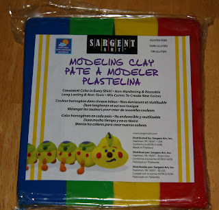
Seismic is an amazing tool, but I love being a geologist because it is so tactile. I decided I needed clay.  It arrived today.  This just might replace colouring as one of my favourite things about being a geologist (although nothing will ever replace being in the field at the very top of the list).

A new package of modeling clay!

I don't think I actually expected to solve my interpretation problems the first time I played with my clay, but after spending a bit of time working with it, I wasn't sure I was going to solve any problems with it.


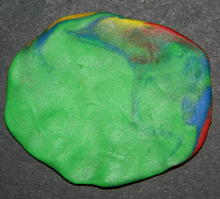
Using 2D imaging to look at a 3D world is a problem in geology, not only when you're looking at seismic, but often when you're looking at the face of an outcrop. It's easy to misunderstand what you're seeing because you're not seeing the whole picture. Something that looks like this from one angle:
One side of a smooshed ball of clay
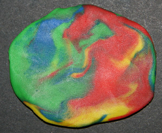
 looks like this from another angle:
The other side of the same smooshed ball of clay.

Monday, July 29, 2013

The African Great Lakes

If you are from Canada or the United States, when you hear "Great Lakes,"  you probably think of these five bodies of water:
The Great Lakes of North America

North America is not the only continent to have Great Lakes; Africa has its own great lakes. Exactly which of the East African Lakes are considered Great Lakes is a bit subjective, but I've labeled the most commonly referred to ones on the zoomed in map below. The African Great Lakes, as well as the smaller lakes found in East Africa are part of the East African Rift System, which will I'll write about in later posts.
The African Great Lakes
The Great Lakes

Some facts about the African Great Lakes:


  • Lake Victoria is the second largest continental lake in the world by surface area (after Lake Superior)
  • Lake Tanganyika is the second deepest continental lake in the world (after Lake Baikal)
  • Lake Tanganyika is the second largest continental lake by water volume in the world (after Lake Baikal)
  • Lake Malawi has more species of fish than any other freshwater lake
  • Lake Tanganyika is the longest lake in the world


All maps created using http://www.geomapapp.org/

Wednesday, July 24, 2013

The beginning

There was a moment, in Kenya, when I looked around at where I was and thought, "this is it. This is what the hard work of the last two years has been for."

I just spent five weeks in Kenya as part of the science crew for HSPDP - the Hominid Sites and Paleolakes Drilling Project. Africa changed me, as it does for so many people, in ways that I probably won't discuss publicly. It also rejuvenated my passion for the research I am doing right now. I'm still organizing my thoughts and photos from the whole thing, but there will be some posts to come.

In the meantime, I've written a post about the one-day safari I went on in Nairobi National Park over at my travelblog.  Check it out here (safari blog) for an account of our adventures - and there were several - and photos of African wildlife.

My last sunset in Turkana

Monday, June 10, 2013

En route to my fifth continent

I'm at Chicago O'Hare right now, on a layover between Syracuse and London. Once I get to London I have another flight to Nairobi, Kenya.

I'm joining the science crew of HSPDP, the Hominid Sites and Paleolake Drilling Project. They are making good progress at the first Kenyan location, at Tugen,Hills near Lake Baringo. In fact things are going so well they'll be done before I get there.

I do get to head up to West Turkana to the second location. We'll be working out of a camp and it's so remote there is no phone or Internet.

I'll have lots of new things to blog about when I get back on July 16 (as well as tackling the backlog of posts I have to catch up on from the last year) but in the meantime I encourage you to search for the HSPDP facebook page. You don't need to have a Facebook account to see it, and that's where the best updates and photos are being posted.

Friday, June 7, 2013

Dunes in Death Valley

On our first night in Death Valley, we camped at Stovepipe Wells. It's a wide open campground, one that I wouldn't want to be in during the heat of summer, but it was a perfect starting point for our first day's itinerary.

Early morning at Stovepipe Wells

As you can see from the photo above, it's a sandy part of Death Valley. In fact, just a short drive from the campground (~ 2 miles) are the Mesquite Flat Sand Dunes, so called because of the mesquite trees among the dunes.

The dunes cover a large area, although the highest one is only 100 feet
(http://www.nps.gov/deva/naturescience/sand-dunes.htm)

Mesquite

Sand dunes are formed by wind-blown sand. When the sand supply, wind direction, and velocity change, so does the type of sand dune that forms:
    • Transverse: constant wind direction and large sand supply
    • Barchan (crescent): constant wind direction but limited sand supply
    • Linear (seif): converging winds and limited sand supply
    • Star: variable wind direction
You can tell which way the prevailing winds blow from the shape of the dunes.

The wind blows the sand up the long windward slope and down the steep leeward slope.

This photo is of the steep (leeward) side of the dunes.
I think the stripe of shadow going down the dune on the right side of the picture is where we went dune running.

Assuming that the shadows are on the leeward side, the prevailing winds blow in the direction of the arrows.
These are mainly linear dunes, but the smallest arrow is pointing to a set of barchan dunes.

Google Earth Image of the sand dunes near Stovepipe Wells.
The red star is the approximate location of the Mesquite Flat Sand Dunes carpark.
The black square shows where the map above is located.
The blue lines outline different types of dunes.
The yellow circle shows a star dune.

Walking across sand dunes is difficult, and climbing up them is grinding, but it is worth it to run down the side of a dune and feel a little bit like you are flying... Those of us that chose to do the dune run left our bags and cameras with the spectators in our group. On the way back, I saw a ripple mark in the sand that wasn't made by the wind, it was a snake track. It would turn out to be the closest we came to seeing a snake on our southwest trip (although a couple of us were on a different field trip to Massachusetts in April and we saw a ribbon snake on that trip). Fortunately, one of my friends had a camera, and he took a photo of the snake track.

Snake track. Photo courtesy of Callum McMillan.


The sand dunes are surrounded by mountains.

In my last post  I showed some pictures of sand dunes preserved in the rocks in Australia. Here's one of those photos again, this time annotated to show the wind direction when the dunes formed. 

At least two different sets of dunes preserved in the Mereenie Sandstone in Australia.
The arrows show the paleowind direction.

If you want to know more about how sand dunes form, I encourage you to look at Chapter 16 of Earths Dynamic Systems, found online here.